Posted on 6. June 2026.
Originally posted on 5. June 2026 on Discord.
hello and welcome wonderful ladies, gentlemen, neithers, boths, and inbetweens to day 2 of milkas' expression corner!
today i'll be talking about the "Bad Piggies Doodle Style", as i like to call it.
the bp doodle style is, well, mostly just a bunch of doodles. as such, it has some inconsistencies with how it depicts certain things, but it's always been endearing to me so no matter if it really counts as a style or not i want to analyze and discuss how the artists at rovio handle doodles drawn by the bad piggies.
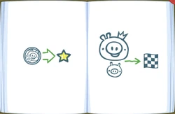
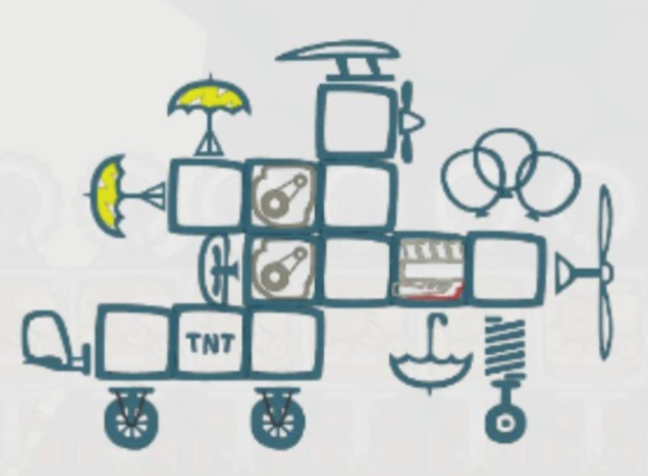
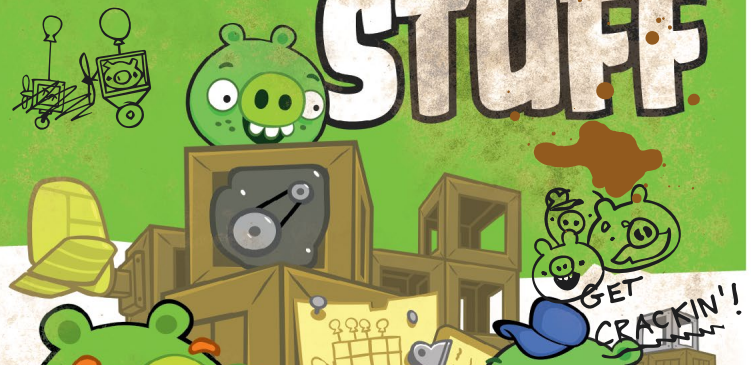
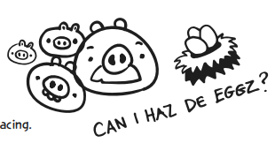
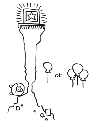
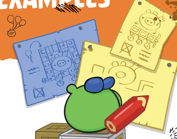
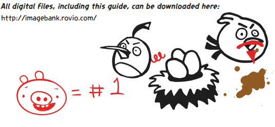
this style has been used to depict general piggy doodles, such as those in the bad piggies guide book which are its most recognizable appearance, as well as mechanic pig's blueprints in a lot of promotional material. it has also been littered throughout the bad piggies brand guide and marketing guide.
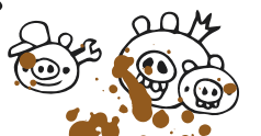
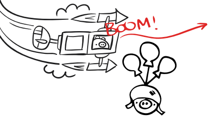
the piggies are often drawn all the same: a circle with two ear shapes slapped on top, two dots for the eyes, and a snout with two dots for the nostrils. it's about the simplest form one can draw a bad piggy in, and it's been relatively consistent throughout the style. foreman pig has a simple mustache and eyebrows tacked on and a different body shape, helmet pig has a simple helmet with square straps on it, king pig has a crown without any jewels or detailing on it, in certain depictions his lip is also drawn on - it's all done as simply as possible, while keeping the essence of the character.
the vehicle-building materials that the bad piggies use appear in this style pretty often as well, and they are, as usual, drawn as simply as possible. the frames are usually just one square, though there may be an inner square drawn as well sometimes (usually when it's depicting mechanic pig's blueprints), and all the objects inside the vehicles are drawn with as little detail as possible, while keeping recognizability. for example, a tnt box may not even be drawn if inside a frame - all an artist has to do is to write TNT on the frame to get the point across.
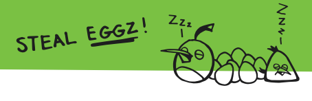
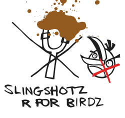
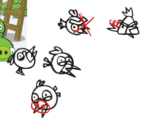
the angry birds are depicted rather inconsistently in the style - they're always simplified, and sometimes get some details wrong or are missing things, such as a missing underbelly or eyebrows, or an overly simplified beak shape, though this is not always the case depending on what is being depicted.
colors are usually only ever used in this style to differentiate objects that are too similar or too close to each other, to avoid confusion. due to being basically a bunch of doodles, it mostly just uses one-note colors.
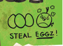
in the marketing guide and brand guide, it is often paired with old internet slang, to symbolize the piggies erratically doodling on the pages and leaving silly remarks.
that's about all i have to say for today's style analysis, if you have any comments or questions feel free to ask, and i'll gladly answer them!